Your readers can't change how they process text, but you can change how your page presents it.
Quick answer
The European Dyslexia Association estimates that 9–12% of Europeans have dyslexia or a related specific learning difficulty. Applied to the EU's 452 million people, that is roughly 41 to 54 million potential readers. Dense paragraphs, buried key facts, justified text and cramped spacing make websites much harder to read for many of them. Clear headings, short sentences, left-aligned text and room to adjust spacing (WCAG 2.2 criteria 1.3.1, 2.4.6 and 1.4.12) make content easier for everyone, and the European Accessibility Act makes accessible content a legal requirement for many EU businesses.
If you want to understand dyslexia itself, including its signs, types and causes, start with our article Dyslexia Explained. This article is about the other side: what your website does to make reading easier or harder, and how to fix it.
Most dyslexia-friendly design advice comes down to one idea. Readers should spend their effort on understanding your content, not on decoding your layout.
How many people in Europe have dyslexia?
Dyslexia figures vary a lot because countries define and measure it differently. Some figures are research estimates of prevalence; others count students who have an official certificate or receive support at school. The headline figures below are the most useful for a European audience.
- 9–12% of the European population has dyslexia or a specific learning disorder, and 2–4% are seriously affected, according to the European Dyslexia Association (association estimate).
- The EU had an estimated 452.0 million inhabitants on 1 January 2026 (Eurostat). Applying the EDA range gives a rough indication of about 41 to 54 million people in the EU. This is our own calculation, not an official count.
- 7.10% of primary school children worldwide have developmental dyslexia (95% CI 6.27–7.97%), with higher rates among boys (9.22%) than girls (4.66%), according to a 2022 meta-analysis in Brain Sciences (Yang et al.). This is a global figure, not a European one.
Country-level figures
| Country | Figure | What it measures | Source |
|---|---|---|---|
| Ireland | About 10% (range 4–17%) | Population estimate, depending on definition | Dyslexia Ireland |
| United Kingdom | 10% | Population estimate | British Dyslexia Association |
| Sweden | 5–8% | Population estimate | Dyslexiförbundet |
| France | 5–7% (severe in 1–2%) | School-age children with specific learning disorders ("dys") | Inserm, via Santé.fr (2019) |
| Italy | 3.0% dyslexia; 6.0% any specific learning disorder | Pupils with an official certification, school year 2022/23 | Italian Ministry of Education and Merit |
| Netherlands | 3.6% | Research estimate, pupils at the end of primary school | Dutch Inspectorate of Education (2019) |
| Spain | 3.1% | Students receiving support for learning disorders, 2024/25 | Spanish Ministry of Education |
| Germany | 10–15% | Pupils with dyslexia or dyscalculia combined | BVL (German dyslexia and dyscalculia association), reported by news4teachers (2025) |
Association estimates usually include milder cases. School figures count certifications or support, which depend on national rules. In the Netherlands, 14% of secondary pupils hold a dyslexia certificate, far above the research estimate. Treat cross-country comparisons with caution.
Low literacy is a wider issue
Dyslexia is not the only reason people struggle with dense text. The OECD Survey of Adult Skills (PIAAC 2023) found that 26% of adults aged 16–65 across OECD countries score at Level 1 or below in literacy, meaning they have low literacy proficiency. These figures measure literacy, not dyslexia, but they show how many adults benefit from clearer writing and layout.
| Country | Adults (16–65) at literacy Level 1 or below, 2023 |
|---|---|
| Poland | 39% |
| Italy | 35% |
| Spain | 31% |
| France | 28% |
| Germany | 22% |
| Ireland | 21% |
| Denmark | 18% |
| Netherlands | 16% |
| Finland | 12% |
| Sweden | 12% |
Source: OECD, Survey of Adult Skills (PIAAC) 2023, Education GPS country profiles. OECD average: 26%.
How text layout affects readers with dyslexia
Dyslexia affects people in different ways, and no single layout suits every reader. Still, several common web patterns create extra work for many dyslexic readers:
- Walls of text. Long paragraphs without headings force readers to read everything to find one fact, such as a price, a date or a deadline.
- Key information buried mid-paragraph. If a refund deadline or delivery date sits in the middle of the fifth sentence, it is easy to miss.
- Justified text. Full justification creates uneven gaps between words, which can form distracting "rivers" of white space down the page.
- Long lines. Text that runs the full width of a large screen makes it hard to find the start of the next line.
- Tight spacing. Cramped line, letter and word spacing makes text feel crowded and harder to track.
- Italics, underlining and capitals for long passages. These can make words run together. The British Dyslexia Association recommends bold for emphasis instead.
- Vague headings. "Information" or "Other" tells the reader nothing. Descriptive headings act as a map.
- Complex sentences and jargon. Long sentences with several clauses increase how much a reader has to hold in mind at once.
- Layouts that break when users adjust them. Many readers use browser extensions or settings to increase spacing or change fonts. If text overlaps or gets cut off, the page fails them.
Try it yourself
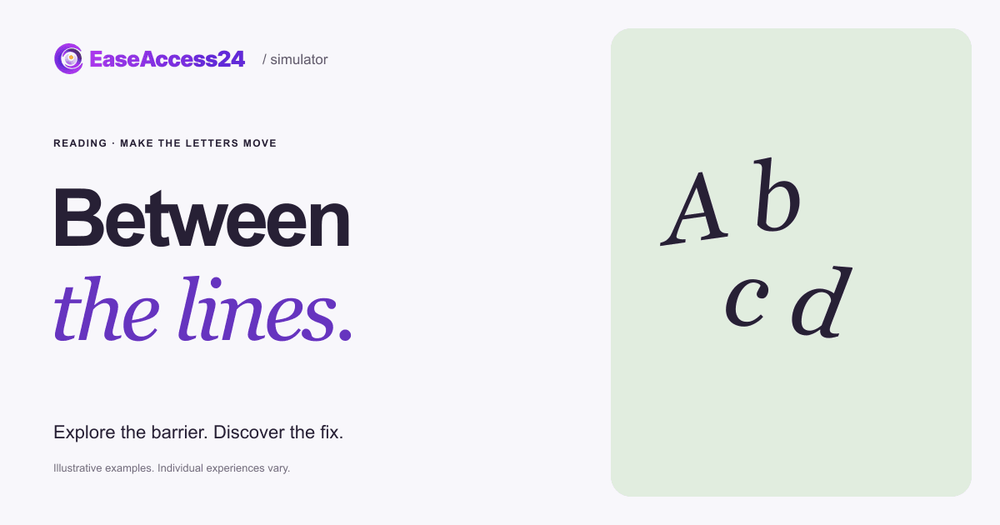
Our free interactive example, Between the lines, gives you one task on a fictional concert ticket site: find the last day to request a refund.
In the inaccessible version, the deadline is buried in a long, dense policy paragraph, and the letters keep shifting slightly as you read. Select Show the fix and the same policy is reorganized: refunds get their own heading, the sentences are shorter and there is more space between lines and paragraphs. The letter effect stays exactly the same, so you can see that the layout, not the effect, is what makes the deadline easy to find. You can pause the movement at any time without changing the design.
The moving letters are an illustration, not a model of dyslexia. Individual reading experiences vary widely. What the example shows is the point of dyslexia-friendly design: the reader didn't change. The page did.
How to make your website dyslexia-friendly
Most of these changes cost little and improve readability for everyone. The British Dyslexia Association's Dyslexia Style Guide and WCAG 2.2 point in the same direction.
Structure
- Break content into sections with descriptive headings, and mark them up as real headings (
<h2>,<h3>) rather than bold text, so screen reader and reading-tool users can navigate them. (1.3.1 Info and Relationships, Level A; 2.4.6 Headings and Labels, Level AA) - Put key facts first. Lead with the date, price or action, then explain. Use lists for steps and options.
- Avoid multiple columns for running text, and keep a predictable layout across pages.
Writing
- Use short, simple sentences and everyday words. Explain unavoidable terms. (3.1.5 Reading Level, Level AAA, recommends content that doesn't require more than lower secondary reading ability, or a simpler version)
- Write clear instructions and labels for forms, rather than relying on placeholder text that disappears. (3.3.2 Labels or Instructions, Level A)
Typography and spacing
- Left-align body text and avoid justification. (1.4.8 Visual Presentation, Level AAA)
- Keep lines to a comfortable length. WCAG 1.4.8 suggests no more than 80 characters; the BDA suggests 60 to 70.
- Use generous line spacing, around 1.5, as both the BDA guide and WCAG 1.4.8 recommend.
- Use bold, not italics, underlining or capitals, for emphasis. Reserve underlining for links.
- Choose a clear sans serif font at a comfortable size, such as 16 to 19 px for body text, as the BDA suggests. A dyslexia-friendly font such as OpenDyslexic can help some readers, but preferences vary, so layout matters more than any one font. See our dyslexia-friendly font page if you want to offer one as an option.
- Use dark text on a light, off-white background with good contrast. (1.4.3 Contrast (Minimum), Level AA)
Let readers adjust the page
- Make sure nothing breaks when people increase spacing. Content must still work when users set line height to 1.5 times the font size, paragraph spacing to 2 times, letter spacing to 0.12 times and word spacing to 0.16 times. Avoid fixed-height text containers. (1.4.12 Text Spacing, Level AA)
- Support zoom and reflow. Text should resize to 200% and reflow at narrow widths without horizontal scrolling. (1.4.4 Resize Text, Level AA; 1.4.10 Reflow, Level AA)
Some of these issues, such as missing heading markup, low contrast or containers that clip enlarged text, can be found with an automated scan using our free accessibility checker. Whether your headings make sense and your key facts are easy to find needs human review. For background on the A, AA and AAA levels, see our complete guide to WCAG principles and levels.
What the European Accessibility Act means for readable content
The European Accessibility Act (Directive (EU) 2019/882) has applied since 28 June 2025. It covers e-commerce services and other consumer services such as banking, e-books and passenger transport, and requires their websites and apps to be perceivable, operable, understandable and robust. "Understandable" is where readable content belongs: people must be able to understand the information and how to use the service.
The Act doesn't name WCAG directly. Conformity is normally shown through the harmonised European standard EN 301 549. The currently cited version, V3.2.1, is based on WCAG 2.1 Level AA, which includes 1.3.1 Info and Relationships, 2.4.6 Headings and Labels and 1.4.12 Text Spacing. A new version, V4.1.1, published in September 2026, aligns with WCAG 2.2 Level AA and is expected to be cited in the Official Journal of the EU in December 2026.
AAA criteria such as 1.4.8 Visual Presentation and 3.1.5 Reading Level are not part of that baseline, but they are good practice for dyslexia-friendly design. Terms and conditions, refund policies and checkout instructions are part of the service, so they should be just as readable as your marketing pages.
FAQ
What is the best font for dyslexia?
There is no single best font. Clear sans serif fonts at a comfortable size, with generous spacing, work well for many readers. Specialist fonts such as OpenDyslexic help some people and not others. The most inclusive approach is a clean default font plus a layout that doesn't break when readers apply their own font or spacing.
Is justified text bad for accessibility?
For many readers, yes. Justification creates uneven word spacing that can make lines harder to track. The British Dyslexia Association recommends left-aligned text without justification, and WCAG 1.4.8 Visual Presentation (Level AAA) includes avoiding justified text.
Which WCAG criteria matter most for dyslexia?
At Levels A and AA, focus on 1.3.1 Info and Relationships (real heading and list markup), 2.4.6 Headings and Labels, 1.4.12 Text Spacing, 1.4.4 Resize Text and 1.4.10 Reflow. At AAA, 1.4.8 Visual Presentation and 3.1.5 Reading Level go further.
Does dyslexia-friendly design only help dyslexic users?
No. Clear headings, short sentences and good spacing also help people with low literacy, people reading in a second language, older readers, people with ADHD and anyone scanning a page on a phone.
Readable content is one of the simplest accessibility improvements you can make. If you'd like an expert review of your key pages, our accessibility audit covers content structure, spacing and readability alongside the rest of WCAG.
Sources
- European Dyslexia Association, "What is dyslexia": https://eda-info.eu/what-is-dyslexia/
- Eurostat, Statistics Explained, "Population and population change statistics" (1 January 2026): https://ec.europa.eu/eurostat/statistics-explained/index.php?title=Population_and_population_change_statistics
- Yang L, et al. "Prevalence of Developmental Dyslexia in Primary School Children: A Systematic Review and Meta-Analysis." Brain Sciences, 2022;12(2):240: https://pubmed.ncbi.nlm.nih.gov/35204003/
- British Dyslexia Association, "Dyslexia": https://www.bdadyslexia.org.uk/dyslexia
- Dyslexia Ireland, "About Dyslexia": https://www.dyslexia.ie/about-dyslexia/
- Dyslexiförbundet, membership brochure: https://dyslexi.org/wp-content/medlemsbroschyr_tryck.pdf
- Santé.fr (Inserm), "Troubles spécifiques des apprentissages : les « dys »" (2019): https://www.sante.fr/node/6407203
- Ministero dell'Istruzione e del Merito, "I principali dati relativi agli alunni con DSA, aa.ss. 2021/2022 – 2022/2023": https://www.mim.gov.it/documents/20182/8938897/Focus_Alunni+con+DSA+aa.ss.202122_202223.pdf
- Inspectie van het Onderwijs, "Dyslexieverklaringen – Verschillen tussen scholen nader bekeken" (2019): https://www.onderwijsinspectie.nl/binaries/onderwijsinspectie/documenten/themarapporten/2019/04/10/dyslexieverklaringen-verschillen-tussen-scholen-nader-bekeken/Rapport+Dyslexieverklaringen+verschillen+tussen+scholen+nader+bekeken.pdf
- Ministerio de Educación, Formación Profesional y Deportes, "Alumnado con necesidad específica de apoyo educativo. Curso 2024-2025": https://www.educacionfpydeportes.gob.es/dam/jcr:27b3a08d-2d3d-41fd-90e2-30b32e6815cc/2024-25-acneae-nota-resumen.pdf
- news4teachers, "Legasthenie und Dyskalkulie: Betroffene fordern Anerkennung – bundeseinheitlich" (February 2025): https://www.news4teachers.de/2025/02/legasthenie-und-dyskalkulie-betroffene-fordern-anerkennung-bundeseinheitlich/
- OECD, Survey of Adult Skills (PIAAC) 2023, Education GPS country profiles (archived copy for Italy; other countries use the same page with a different country code): https://web.archive.org/web/20260830094332/https://gpseducation.oecd.org/CountryProfile?primaryCountry=ITA&treshold=10&topic=AS
- British Dyslexia Association, "Dyslexia friendly style guide" (archived copy, June 2025): https://web.archive.org/web/20250629142524/https://www.bdadyslexia.org.uk/advice/employers/creating-a-dyslexia-friendly-workplace/dyslexia-friendly-style-guide
- W3C, Understanding WCAG 2.2: 1.4.12 Text Spacing: https://www.w3.org/WAI/WCAG22/Understanding/text-spacing.html
- W3C, Understanding WCAG 2.2: 1.4.8 Visual Presentation: https://www.w3.org/WAI/WCAG22/Understanding/visual-presentation.html
- Directive (EU) 2019/882 (European Accessibility Act): https://eur-lex.europa.eu/eli/dir/2019/882/oj
- National Disability Authority (Ireland), "EN 301 549 V4.1.1 published": https://nda.ie/news/en301549-published