Around 8% of men of European ancestry cannot reliably tell certain reds and greens apart. If your website signals "available" in green and "sold out" in red, some of your customers cannot read the message.
Quick answer
Large population surveys put red-green color vision deficiency at about 8% of men and about 0.4% of women of European ancestry. Applied to the EU's 2025 population, that is in the region of 18 million people, though there is no official EU-wide count. The most common website barrier is information shown by color alone: status dots, red error borders, colored chart lines and links distinguished only by color. The fix is simple and required by WCAG 2.2 success criterion 1.4.1 Use of Color: always pair color with text, an icon, a pattern or a shape.
How many people in Europe are color blind?
"Colour blindness" is the everyday name for color vision deficiency (CVD). Most people with CVD see colors, but some color pairs look alike. The inherited red-green forms are by far the most common. They are carried on the X chromosome, which is why men are affected far more often than women.
There is no Eurostat or European Health Interview Survey indicator for color vision. The best European evidence comes from large screening studies, mostly done with Ishihara color plates, and from reviews that combine them. The standard reference is Jennifer Birch's 2012 review in the Journal of the Optical Society of America A. It concludes that "large random population surveys show that the prevalence of deficiency in European Caucasians is about 8% in men and about 0.4% in women" [1].
The individual European studies in that review are remarkably consistent:
| Country | Study (year) | Men examined | Men with red-green CVD | Women examined | Women with red-green CVD |
|---|---|---|---|---|---|
| Norway | Waaler (1927) | 9,049 | 8.01% | 9,072 | 0.44% |
| Germany | Schmidt (1936) | 6,863 | 7.75% | 5,604 | 0.36% |
| Germany | Feig and Ropers (1978) | 5,565 | 7.80% | n/a | n/a |
| France | Kherumian and Pickford (1959) | 6,635 | 8.95% | 6,990 | 0.50% |
| Greece | Koliopoulos et al. (1976) | 21,231 | 7.95% | 8,754 | 0.42% |
| Netherlands | Crone (1968) | 3,167 | 7.95% | 3,359 | 0.45% |
| Finland | Forsius et al. (1967) | 2,604 | 7.90% | n/a | n/a |
| Belgium | François et al. (1957) | 1,241 | 8.48% | n/a | n/a |
| Switzerland | Von Planta (1926) | 2,000 | 7.95% | 3,000 | 0.43% |
Source: Birch (2012), Tables 2 and 3 [1]. Screening with Ishihara plates. These are historical studies; the review uses them because they are large and population-based.
A more recent European example comes from Ireland. A 2021 study of 1,626 randomly sampled schoolchildren aged 6–7 and 12–13, tested with the Hardy-Rand-Rittler plates, found CVD in 8.3% of boys and 1.8% of girls [2]. Deutan types (the green-sensitive type) were the most common in both sexes. A 2025 global meta-analysis of children and adolescents found that people of European descent had the highest prevalence of any ancestry group: 2.77% for boys and girls combined [3].
What that means in numbers
Eurostat does not publish a count of color-blind people, so the figures below are our own illustrative estimate. We applied Birch's European rates (8% of men, 0.4% of women) to Eurostat's population on 1 January 2025 [4]. Real numbers will differ, because the rate varies with ancestry and the EU population is diverse.
| Area | Men (2025) | Women (2025) | Estimated people with red-green CVD |
|---|---|---|---|
| EU-27 | 221.1 million | 230.2 million | about 18.6 million |
| Germany | 41.2 million | 42.3 million | about 3.5 million |
| France | 33.4 million | 35.4 million | about 2.8 million |
| Italy | 28.9 million | 30.1 million | about 2.4 million |
| Spain | 24.1 million | 25.0 million | about 2.0 million |
| Poland | 17.6 million | 18.9 million | about 1.5 million |
| Netherlands | 9.0 million | 9.1 million | about 0.75 million |
Estimate: Eurostat population (demo_pjan, 1 January 2025) multiplied by 8% for men and 0.4% for women. Not a measured count.
For comparison, the UK charity Colour Blind Awareness estimates about 3 million color-blind people in the UK, roughly 4.5% of the population [5]. It does not publish the method behind that figure.
The practical point for a website owner: if roughly 1 in 12 of your male visitors may struggle with a red and green pair, color-only design is not an edge case.
How color blindness affects using websites
Color vision deficiency rarely stops someone using a site completely. It makes some information ambiguous, which is often worse, because people act on a guess. Typical barriers include:
- Status shown only by color. Green "in stock" and red "out of stock" dots, colored seat maps, calendar availability, traffic-light ratings.
- Form errors shown only by a red border. The field looks the same as every other field, so the visitor does not know what to correct.
- Links that differ from body text only by color. Without an underline, links can disappear into the paragraph.
- Charts and maps with color-coded series. Red and green lines, or a heat map running from green to red, become one indistinct band.
- Selected states shown only by a color change. A chosen size, date or plan tile that turns from gray to green.
- Low-contrast color pairs. Some colors also look darker or lighter to people with CVD. Red, for example, can appear darker to people with protan types, so red text on a dark background can lose contrast.
None of these problems needs a different visual style to fix. The color can stay; it just cannot be the only clue.
Try it yourself: pick a concert seat
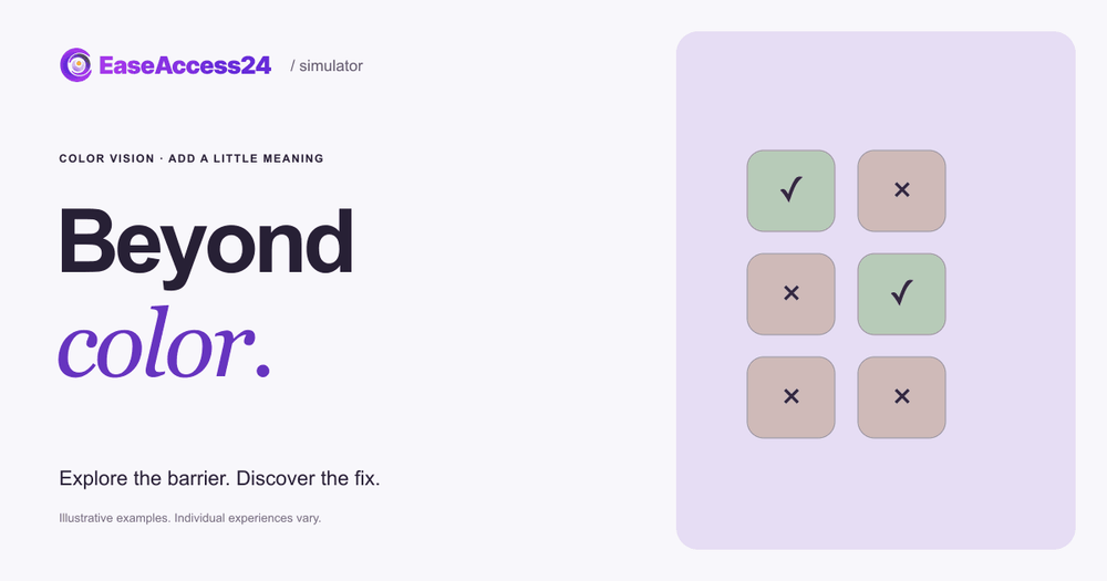
Our free Accessibility Simulator includes an interactive example built around this exact problem: Beyond color.
You are on a fictional ticket site and your task is to choose an available seat. Green seats are free and red seats are sold out, and color is the only clue. The seat map is shown through an illustrative filter that approximates red-green color blindness (deuteranopia). Under that filter, both the green and the red seats look like the same gold. Try to pick a seat you are sure about.
Then select Show the fix. The color filter stays exactly the same, but each seat now carries an "Available" or "Sold out" label, plus a checkmark or a cross. You can switch between the inaccessible and accessible versions as often as you like.
The filter is an approximation. It illustrates the design barrier, not any individual's experience of color vision. What it shows clearly is that the repair does not depend on the visitor's eyes changing. It depends on the page saying the same thing in more than one way.
How to fix color-only design on your website
Use this checklist when you review designs and pages. The WCAG 2.2 success criteria in brackets are the ones most directly involved [6].
- Pair every color cue with text, an icon or a pattern (1.4.1 Use of Color, Level A). "Sold out" next to the red seat; a cross icon on unavailable dates; a written status in the order table. WCAG 1.4.1 says color must not be "the only visual means of conveying information, indicating an action, prompting a response, or distinguishing a visual element."
- Write form errors as text (1.4.1, plus 3.3.1 Error Identification, Level A). Show a message such as "Enter a valid postcode" next to the field, ideally with an icon, not just a red border.
- Make links identifiable without color. Underline links in body text, or give them another non-color cue. If you rely on color alone, the link color needs at least 3:1 contrast with the surrounding text plus an extra cue on hover and focus (see the W3C techniques for 1.4.1).
- Give charts direct labels or patterns. Label lines at their ends, use different marker shapes or dash styles, and offer the data as a table.
- Show selected and active states with more than color. Add a checkmark, a thicker border, bold text or the word "Selected".
- Keep graphical objects and controls visible (1.4.11 Non-text Contrast, Level AA). Icons, input borders and focus indicators that carry meaning need at least 3:1 contrast against adjacent colors.
- Do not refer to color alone in instructions (1.3.3 Sensory Characteristics, Level A). "Press the green button" should become "Press Continue (the green button)".
- Test in grayscale and with a color-vision filter. If a screen still makes sense in grayscale, it does not depend on hue. Browser developer tools in Chrome and Firefox can emulate common types of color vision deficiency.
- Check text contrast (1.4.3 Contrast (Minimum), Level AA). Use our free contrast checker to test a color pair against the 4.5:1 and 3:1 thresholds.
Automated tools can find some of these issues, such as low contrast. They cannot reliably tell whether a red dot is the only way a status is communicated. Our free accessibility checker is a useful first scan, but color-only meaning usually needs a human review of key journeys such as booking, checkout and account pages.
If you are new to WCAG, our complete guide to WCAG principles, levels and standards explains how success criteria and conformance levels fit together.
What the European Accessibility Act means for color
The European Accessibility Act (Directive (EU) 2019/882) applies to products placed on the market and services provided to consumers after 28 June 2025 [7]. Covered services include e-commerce, consumer banking, e-books, electronic communications and elements of passenger transport services such as websites, apps and ticketing [7][8].
Color is addressed directly in the Directive's Annex I:
- For products, the user interface must, "when the product uses colour to convey information, indicate an action, require a response or identify elements, … provide an alternative to colour" (Annex I, Section I, point 2(d)).
- The functional performance criteria require that, where a product or service provides visual modes of operation, "it shall provide at least one mode of operation that does not require user perception of colour" (Annex I, Section VII, point (c)).
- For services, websites and mobile applications must be made accessible "in a consistent and adequate way by making them perceivable, operable, understandable and robust" (Annex I, Section III, point (c)).
In practice, EU web accessibility work is measured against the European standard EN 301 549, which incorporates WCAG 2.1 Level AA for web content [9]. WCAG 1.4.1 Use of Color is a Level A criterion in both WCAG 2.1 and 2.2, so it is part of any baseline you test against. Microenterprises that provide services are exempt from the Directive's service requirements [7], but color-only design affects their customers in exactly the same way.
Frequently asked questions
What percentage of Europeans are color blind?
There is no official EU-wide count. Large population surveys summarized by Birch (2012) put red-green color vision deficiency at about 8% of men and 0.4% of women of European ancestry [1]. Applied to the EU-27 population in 2025, that suggests roughly 18 to 19 million people, but this is an estimate rather than a measured figure.
Which type of color blindness is most common?
Deutan types, which affect the green-sensitive cones, are the most common. In the Norwegian data reported by Birch, deutan types made up about three-quarters of red-green cases in men [1], and deutan was also the most common type among Irish schoolchildren [2]. The simulator example uses a deuteranopia approximation for this reason.
Is it enough to choose color-blind-friendly colors?
Better color choices help, but they do not meet WCAG 1.4.1 on their own. Color vision varies, screens and lighting vary, and some people use grayscale or high-contrast modes. The reliable fix is to add a non-color cue: text, an icon, a pattern or a shape.
Do red error messages fail accessibility?
Red is fine. A red border alone is the problem. If the error is also written out as text and the field is clearly identified, color becomes a helpful extra rather than the only signal.
How can I test my website for color-only information?
View key pages in grayscale and with a color-vision emulation in your browser's developer tools. Then ask whether every status, error, link and chart still makes sense. Check contrast with a contrast checker, and include color-only meaning in your manual review or accessibility audit.
Next step
Open the Beyond color example, then look at your own booking, checkout or status pages through the same lens. If you want a structured review, our accessibility audit identifies information conveyed by color alone and gives your team code-level guidance to fix it.
Sources
- Birch J. "Worldwide prevalence of red-green color deficiency." J Opt Soc Am A 2012;29(3):313–320. Review of population surveys; Tables 2 and 3 list European studies using Ishihara plates. https://opg.optica.org/josaa/abstract.cfm?uri=josaa-29-3-313 (abstract: https://pubmed.ncbi.nlm.nih.gov/22472762/)
- Harrington S, Davison PA, O'Dwyer V. "Prevalence of colour vision deficiency in the Republic of Ireland schoolchildren and associated socio-demographic factors." Clin Exp Optom 2021;104(1):48–55. 1,626 children, HRR plates. https://pubmed.ncbi.nlm.nih.gov/32285548/
- Jeong YD et al. "Global Prevalence of Congenital Color Vision Deficiency among Children and Adolescents, 1932–2022." Ophthalmology 2025;132(12):1431–1444. Meta-analysis of 56 studies. https://pubmed.ncbi.nlm.nih.gov/40769301/
- Eurostat. Population on 1 January by age and sex (demo_pjan), 2025 data for EU-27 and Member States. https://ec.europa.eu/eurostat/databrowser/view/demo_pjan/default/table
- Colour Blind Awareness. "Colour blindness." https://www.colourblindawareness.org/colour-blindness/
- W3C. Web Content Accessibility Guidelines (WCAG) 2.2, and Understanding SC 1.4.1 Use of Color. https://www.w3.org/TR/WCAG22/ and https://www.w3.org/WAI/WCAG22/Understanding/use-of-color.html
- Directive (EU) 2019/882 of the European Parliament and of the Council on the accessibility requirements for products and services (European Accessibility Act), Articles 2, 4 and Annex I. https://eur-lex.europa.eu/eli/dir/2019/882/oj/eng
- European Commission. "European Accessibility Act." https://commission.europa.eu/strategy-and-policy/policies/justice-and-fundamental-rights/disability/union-equality-strategy-rights-persons-disabilities-2021-2030/european-accessibility-act_en
- W3C Web Accessibility Initiative. "Web Accessibility Laws & Policies: European Union" (EN 301 549 and WCAG 2.1 Level AA). https://www.w3.org/WAI/policies/european-union/